
166% Conversion Rate Increase
Situation: One of the projects I worked on was generating leads in the reverse mortgage industry with my business partner. We were looking to generate high quality leads at a reasonable cost. What follows is a brief review of 3 tests we performed.
Results Summary:
Test A - 7.5% conversion rate.
Test B - 12% conversion rate.
Test C - 20% conversion rate.
How Did We Do it? Implementing best practices based on real world experience, deep research on conversion optimization, and countless hours of talking, thinking, researching, thinking, talking, building, re-thinking, re-researching, re-building. You get the point. A lot of time, thinking and paying attention to every little detail is how you have to do it when you're a small business. And, that's how you should do it when you're a big business.
Deeper Dive:
Test A: 7.5% conversion rate. We built a microsite focused on several of the main questions customers were interested in understanding when it comes to reverse mortgages. They wanted to understand What it is, Benefits, How they Qualify, and "Why this company." We used a combination of conversion-oriented copy and video to connect content with the consumer. And we opted for a 2-step form; the idea being show a short form on page 1, get people started, with the hypothesis of a higher overall form completion rate by the time they get to page 2. As it turned out, we were within our target ROI for the campaign and had a 7.5% lead capture rate. Our sales partner was happy, and wanted us to continue working with him.


Test B: 12% conversion rate. For this test we built a new design, focusing on the Long Page website and some dynamic functionality for geo-targeting with both our campaign structure and our website experience. We focused content on customer testimonials and went deep with a "Why this company" theme on the site. We pivoted to a responsive design and made a bigger push to get consumers to call. The lead form was simplified vs. Test A. Again, we hit our target ROI and the 12% lead capture rate was a 71% increase from Test A. As we ran this, we eventually saw a competitor copy our exact design.
There were several other sections to the experience. For simplicity, here is the home page and the lead form.


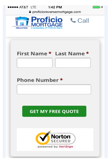
This is the mobile lead form. Optimized, clean design with click to call.
Test C: 20% conversion rate. For this test we made another big swing with a new approach. In fact, based on data we had looked at, and what the marketplace was doing, we decided to go mobile first. The simplicity of the design we chose - being an interactive experience, with what's essentially an iterative form process - lended itself to a mobile first approach if we did it right. The level of detail it took was more than meets the eye, but we spent countless hours, days, nights, again, thinking, researching, designing, shifting requirements until we got it right. We catered not just to the mobile browser, but also the mobile customer (two different things) and their desire to have an easy click-to-call design, via the static red call-now button. Through our Google Enhanced campaign, we adjusted bidding by 40% in order to be at the top of the mobile search results. This shifted the mix of leads from form fills to calls, and increased value per lead. We were only able to do this because we could afford it, and it became a differentiator vs. the competition. And we could only afford it because our cost per lead was within our target range. In other words, we were able to pay the premium to be at the top of the mobile search rankings because our conversion rate was so high. If you look around the marketplace, there are not many companies trying this simple (to the eye) approach for conversion. There are a lot of moving parts, a lot to think about, and lot to execute and manage.
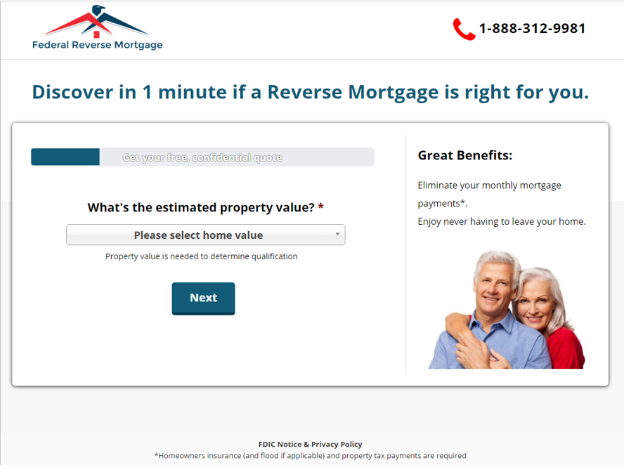


Fully optimized mobile experience. Focus on great UX, progressive form, and click to call.
